Litify Inbox Redesign
Background
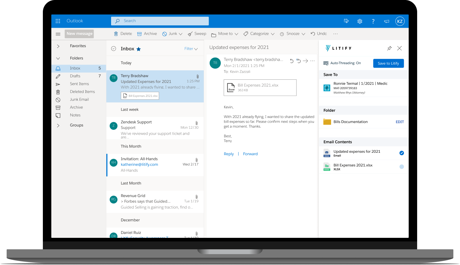
Litify Inbox is a 3rd party Outlook integration tool, that helps users synchronize data between their Salesforce and Microsoft Outlook accounts. The existing version of Inbox suffered from technical issues and frequently received user complaints related to its nonintuitive design and lack of customer support.
To offer a comprehensive solution to all the problems associated with Inbox, Litify decided to build its own email integration solution—called Thread—and chose me to spearhead the project from a UX standpoint.
The Thread team
The Litify Thread team was comprised of myself as the lead UX Designer, a product manager, and 6 developers.
My role
I led the design strategy from soup to nuts—conducting user research -> defining product scope –> developing an on-brand design system –> leading the design through multiple iterations –> to validating each iteration through carefully planned (live) user testing sessions.
Research
It was clear early on from user feedback, that saving emails to Litify was a tedious—and often unreliable—process. My primary goal during the initial research was to learn about Inbox users’ central need for a reliable email-syncing tool—and how different users were currently satisfying this need.
In my search for Inbox-specific learning guides and training material, I stumbled upon an invaluable dataset: the completed provisioning forms of all our live customers. A provisioning form is essentially a comprehensive questionnaire that new clients are required to fill out for onboarding. The questionnaire outlines how they would like their instances set up, including specified feature configurations and any unique customizations. I sifted through these forms to gather insight into exactly how our users were trying to configure their instances to fit their given needs.
By understanding the scope of features our clients selected and the specific requirements that they set for each feature, I was better able to mentally piece together the user journey. Dissecting these configurations even further led me to uncover process-oriented workflows that were unique to different user types—mostly based on role (paralegal vs attorney vs general counsel)—but common across orgs.
I also attended every training session that our Customer Success team arranged for each of our new Inbox customers. These sessions helped me see Inbox from the perspective of a new user, offering me a glimpse into their thought processes and allowing me to better understand the mental models I was working with (and how they were shaped). These training sessions were critical for learning how these fresh expectations differed from those of our seasoned users, who had likely adapted their behaviors over time.
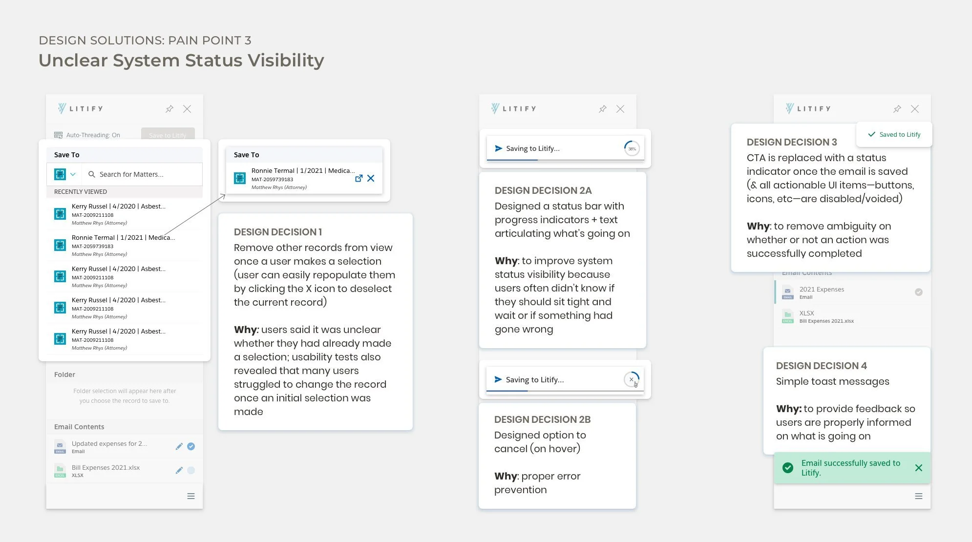
The panel itself took a long time to load, and users were often confused about whether the system was still loading, or if a problem had occurred
After saving an email, users often had to go to the Litify app to double check that it had properly saved—a habit that became second nature to many users
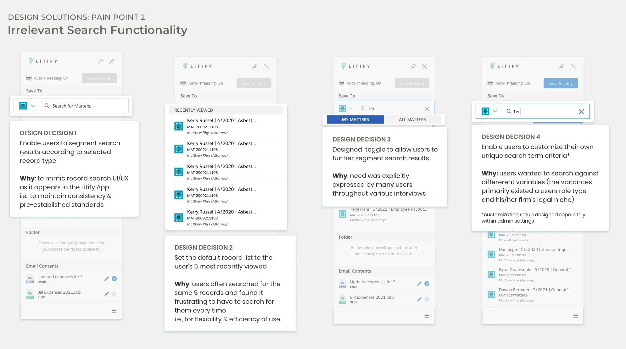
Many users expressed dissatisfaction with the search functionality as they often had to have an instance of the Litify app open on a separate screen (or worse, toggle between apps when working off their iPads) to access reference numbers/IDs they could plug into the search bar
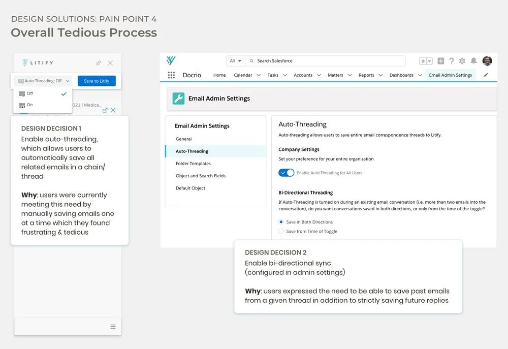
Users often wanted to save all emails in a thread to Litify at once but could only accomplish this manually, having to tediously save each and every reply
Key observations
Defining the design problem(s)
After brainstorming with our product manager, I decided to conduct a rough heuristic analysis of Inbox to try to narrow down my focus for the design. Although conducted in haste, this heuristic evaluation enabled me to translate my user interview findings into a more concrete list of specific usability problems that I would attempt to solve through design:
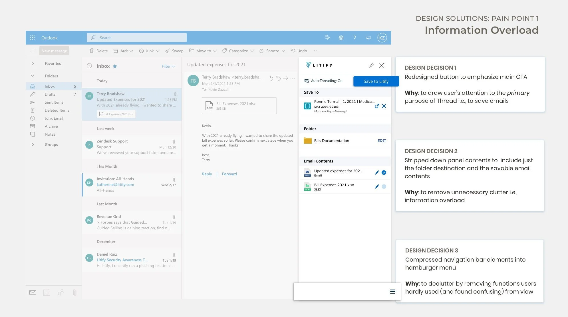
Information overload
Irrelevant search functionality
Unclear system status visibility & inadequate system feedback
Lack of automation (aka too many manual processes that were tedious and error-prone)
Ideation
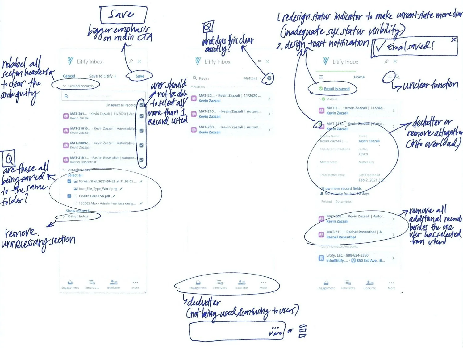
To kick off the ideation process, I printed out screenshots of Inbox and started annotating the existing design with ideas, open questions and any potential UI/UX concepts I wanted to explore.
I approached this exercise from the perspective of our existing user base, by tying in the insights I pulled from my research findings. I wanted to understand the impact of mental models here amongst a user group that isn’t particularly known for its technological literacy: lawyers.
I eventually came to understand that in order to design a solution that would work for our particular user group—i.e., lawyers who not only traditionally rank low on the technology literacy scale, but are also notoriously resistant to change—I’d have to make the system conform to their unique mental models (at least to some degree).
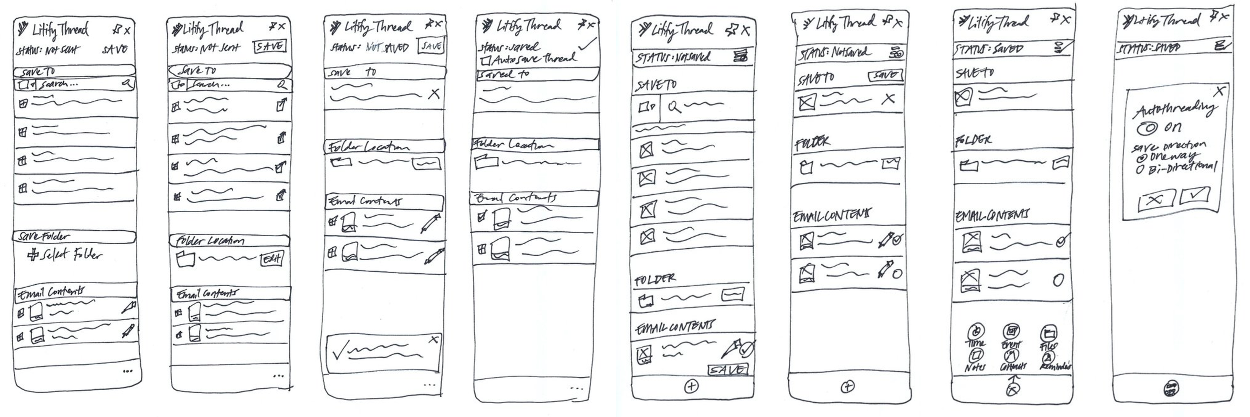
My solution exploration began in rough sketches and eventually evolved through successive rounds of user interviews and technical discussions with the devs.
Problems → Solutions
Results
After running multiple user research studies, and working closely with our product, engineering, and customer success partners, we launched our initial MVP experience in August 2021.
Unfortunately, I don’t have any metrics to share on the impact of this project as I had decided at this point to move back to New York City and was no longer with Litify post-launch.
